Community
Posted Oct 27, 2017
•
1 min read
How to create corporate advertising that sells - Swipe File
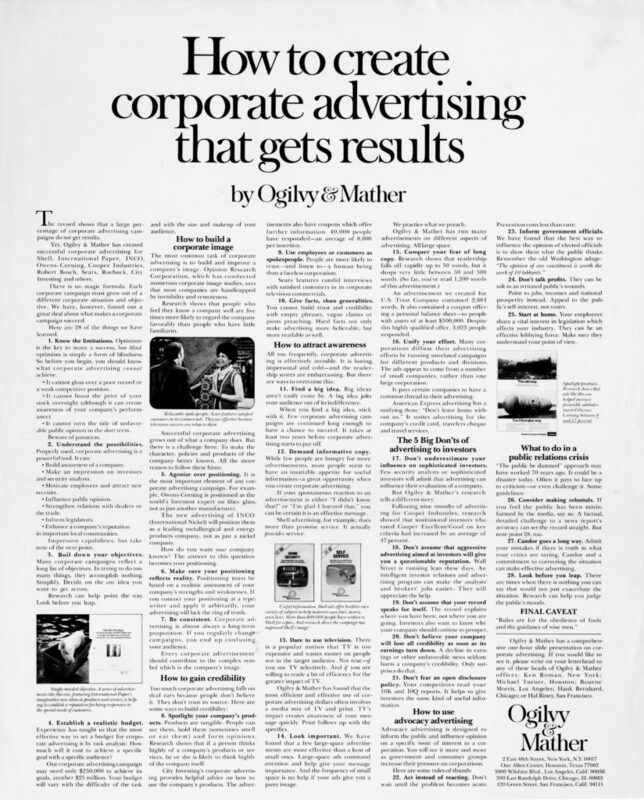
This Ogilvy print was part of the famous "How to" campaign that showcased the Ogilvy's strategy and copywriting skills. Red areas are most likely to attract attention, followed by Yellow/Orange areas, and Blue areas. Areas that have no color overlay are unlikely to attract visual attention. The Regions Report graphically represents the likely...Read More
More Ways to Read:
🧃
Summarize
--
The key takeaways that can be read in under a minute
Sign up to unlock

Worth the squeeze
Get access to the condensed version of this piece, and every other article on The Juice by AudiencePlus, and so much more.
Start a free account on The Juice and we'll send you weekly emails sharing which podcasts, blogs, guides,
etc. are trending with other marketing or sales pros. We call it the Top 5!
Other content from
Swipe Files
Featured by Salesforce


