3 min read
Custom Chart Colors and Brand New Palettes
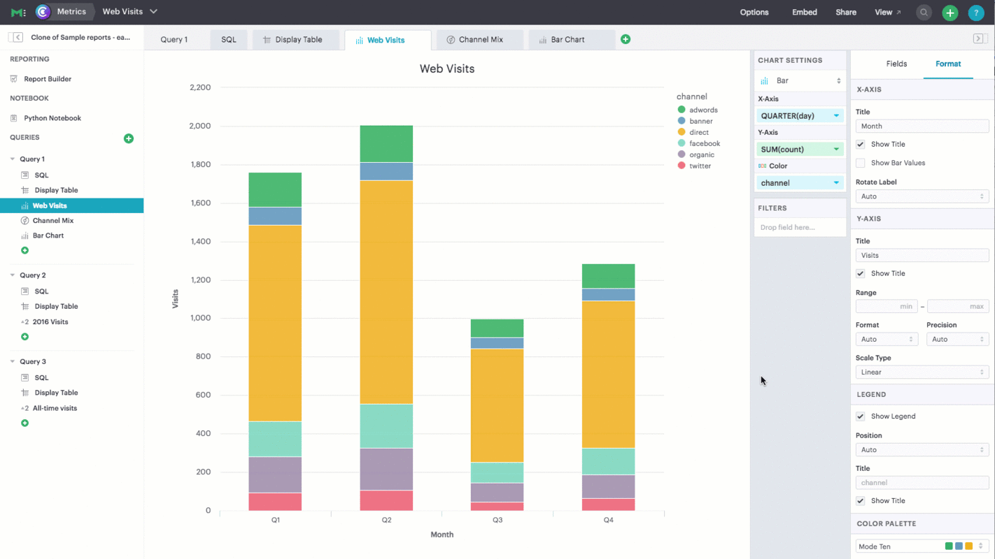
Colors are key to understanding data visualizations. They represent your data and guide people through charts and dashboards, making them easier to digest. Colors also represent your brand, providing a recognizable look and feel to everything your company produces.
We're rolling out new functionality in Mode that provides you the flexibility to use colors in a way that represents both your data and your brand: Custom color palettes.
Customize charts and dashboards with color palettes you define. Set your own default colors so everyone builds and delivers on-brand visualizations without thinking twice
More Ways to Read:
🧃
Summarize
--
The key takeaways that can be read in under a minute
Sign up to unlock

Worth the squeeze
Get access to the condensed version of this piece, and every other article on The Juice by AudiencePlus, and so much more.
Start a free account on The Juice and we'll send you weekly emails sharing which podcasts, blogs, guides,
etc. are trending with other marketing or sales pros. We call it the Top 5!
Other content from
Mode
Featured by OneScreen.ai


