Associated with
6 min read
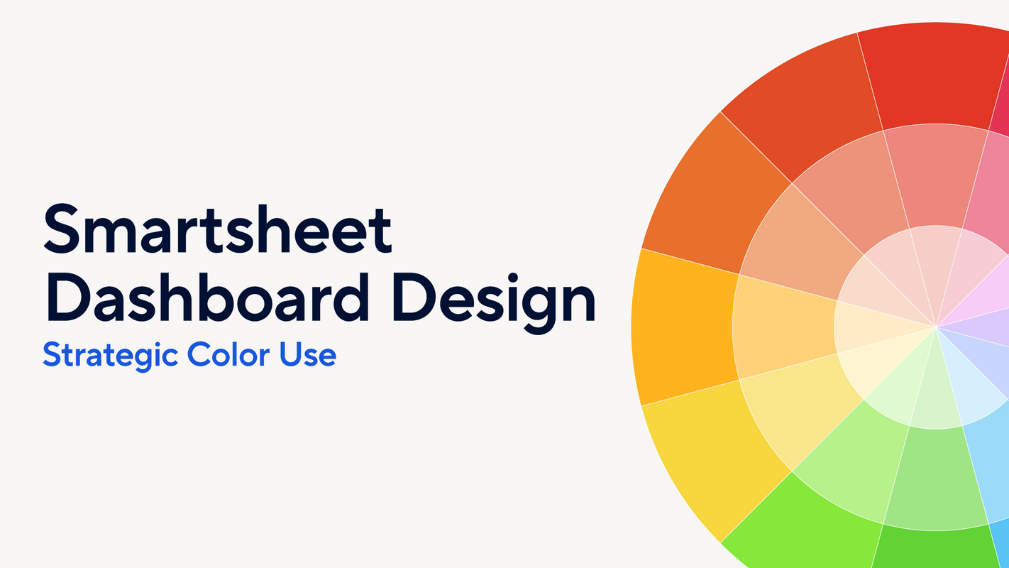
Smartsheet Dashboard Design: Strategic Color Use
Welcome! In this new dashboard design-focused series we'll teach you how to make your dashboard look stunning and professional at the same time. We'll cover the most important aspects of dashboard design - color palettes, font sets, layouts, and more - and accompany those teachings with recommendations you'll be able to use to take your dashboards to the next level.
To kick things off we're going to start with one of the most impactful aspects of a dashboard: the color palette. Color is a very powerful tool in dashboard design. It can evoke emotions, highlight important information, and aid in data comprehension. Choosing the right color palette is crucial for creating visually appealing and effective dashboards.
More Ways to Read:
🧃
Summarize
--
The key takeaways that can be read in under a minute
Sign up to unlock

Worth the squeeze
Get access to the condensed version of this piece, and every other article on The Juice by AudiencePlus, and so much more.
Start a free account on The Juice and we'll send you weekly emails sharing which podcasts, blogs, guides,
etc. are trending with other marketing or sales pros. We call it the Top 5!
Other content from
Smartsheet


Featured by Salesforce
